GRAFICA AND DESIGN

"Graphics" is the term through which an idea, a concept takes its visual profile through vector signs or photographic images. The processing of these two elements, associated or separated according to the condition, constitute the representation of a logo, a brand, a catalog, an information leaflet, a brochure or a harmonized image.
A graphic project for us is synonymous with the visual expression of a concept through the conscious ability and attention to detail.
The harmonious body is a functioning and conveying part of the information that the buyer asks us to deliver to bewitch a specific part of the public, of customers. The report of a graphic work, through the technique and tools available (diligent essential for a compliant result), brings with it all the characteristics of the company or the patron
The graphics combined with the design represent profile, color, font, brightness, texture, line and size. Through creativity we achieve to design solutions suitable for every question.
THE BUSINESS CARD HAS A SOUL!
The print finishes make our product effective and prestigious
Hot stamping gold, silver, copper and many other shades, screen printing, relief printing, glossy UV varnishing and an infinite possibility for our graphic supports! Yes, our brochure or business card, flyer, label, postcard, book and all our ideas on paper acquire value with a typographic processing that leaves no room for neglect.
Designed graphics combined with a sophisticated, chic and impactful type of print, aims to make a project a "best seller".
The ennobling excels the approach with our buyer!
Customizing a professional graphic with these characteristics means giving energy to a paper support, transferring its particularities to the communicative element that most supplies us, which will involve the habitué and fascinate him.
Leaving an emotionality to one of our patrons is like offering a pragmatic impression to those who observe us.
Be recognized for our style!
Making a difference, always and in any case with experience, professionalism and competence.
INFOGRAPHIC: THE CONTENT MARKETING
CWhat is an infographic and why use it?
Infographic is used to directly and effectively express an idea or theme through the logical use of graphic symbols and concise texts. infographic, or "information graphic", is information projected in a more graphic and visual than textual form. Infographic is therefore a graphic image that contains relevant information for the reader. It is a visual disclosure of a certain poem.
What is an infographic made of?
Infographic is used to directly and effectively express an idea or theme through the logical use of graphic symbols and concise texts. infographic, or "information graphic", is information projected in a more graphic and visual than textual form. Infographic is therefore a graphic image that contains relevant information for the reader. It is a visual disclosure of a certain poem.
What are the benefits?
The use of infographic makes writing easier and more engaging. Everyone knows that images are a perfect way to grab a reader's consideration. In fact, often, human beings skip reading a text and try to find every type of seductive aspect with their eyes.
An infographic can overcome the difficulty of ineffective reading: research shows that the majority of the collective respond better to visual notifications than to written only.

Elements that establish an adequate infographic:
- Highlight many concepts
- Hit the key theme
- It is simple to understand
- It is creative and inviting
- Compendium capacity
- It engulfs key definitions and branding
- It makes the mission clear
THE LANGUAGE OF IMAGES
In graphic design, the use of the effigy is part of the disclosure process, that is, announcing the fairness of the consumer. Whether it's for a social network post, a blog, a brochure or a poster, what we imprison is the effigy we use.
But how are the right images chosen?
The graphic designer knows how to start from the initial perspective of analysis of a project, if he makes it his own and then renews the notion through a figurative element. There is therefore a sort of transposition, change, of what is said (verbally or only mentally) into what can be perceived, explored, dissected.
Illustrations, infographics, photographs and elaborate images help users and regular users to get an immediate idea of a product or service involved. The visual language, variegated by graphics, organisms, texts and colors, plays a very necessary role in attracting diligence from bystanders. The effective use of graphic design and intentions helps to achieve this target.
The visual aspect of the graphics is as important as the message it announces.
GRAPHIC DESIGN: 3 TYPES OF GRAPHIC DESIGN
The graphics use visual combinations to express ideas through typography, image, color and profile. There are several types of graphic design, each with their own area of specialization. Although often overlapping, each type of graphic design requires specific design skills and techniques. Although there are different types of graphic works, we see three together that preserve the main activities that we carry out at TCJ
1. Graphic design of the visual identity
A trademark is a relationship between a company (or company, firm, entity) and its collective. An identity brand is how the company announces its individuality, its accent and substance, as well as memories, emotions and experiences. The visual identity of graphic design is exactly this: the visual material of the brand identity takes the place of the face of a brand to announce those abstract qualities through images, profiles and colors.

2. Marketing and advertising graphics
Great marketing engages humans based on their ambitions, needs, conscience and complacency about an item, service or brand. As men and women will find the visual park more and more engaging, graphic design helps facilities or companies to start and announce more effectively, through business cards, postcards, flyers, newspapers, posters, banners, brochures, catalogs, adhesive labels, photo books and all printing vehicle supports.
3. Graphic design of a website
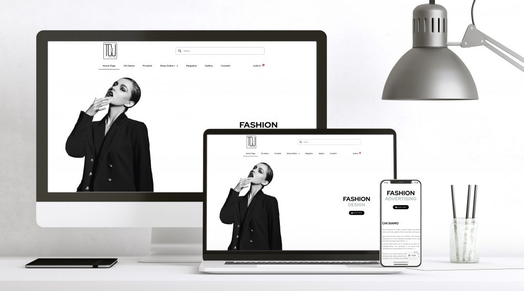
La connessione utente è il modo in cui un utente interagisce con un dispositivo, un’applicazione o un sito web. La progettazione dell’interfaccia utente è il processo di progettazione delle interfacce per renderle semplici da usare e procurare un’esperienza user-friendly. La connessione utente include tutta la praticità che ha un utente quando interagisce con lo schermo, la tastiera e il mouse, ma nella circostanza della progettazione grafica, il design della connessione utente si concentra sulla consapevolezza visiva dell’utente e sulla progettazione di fattori grafici su schermo come pulsanti, menu, micro-interazioni e altro. È una prestazione da designer far soppesare l’aspetto estetico con la funzionalità tecnica.
ADVERTISE CORRECTLY, MIRRORING THE VALUES AND ESSENCE OF THE BUYER
When a buyer has to announce his skills and reality through his commercial activity or his company, he needs to give all his potential in a clear and adequate way. To arrive at a clear communication, it is necessary to establish a priori the goals to be reached and to establish a strategy that offers entrepreneurial opportunities, excluding incompleteness. With a good auscultation of the client's requests, precise and tailor-made graphics, an announcement can be obtained designed to give value to the work and to the performance of an activity. Advertising made with creativity and enthusiasm reflects the austerity, professionalism and care of a company.
LOGO: TELL YOUR STORY, THE EXPERIENCE OF YOUR COMPANY.
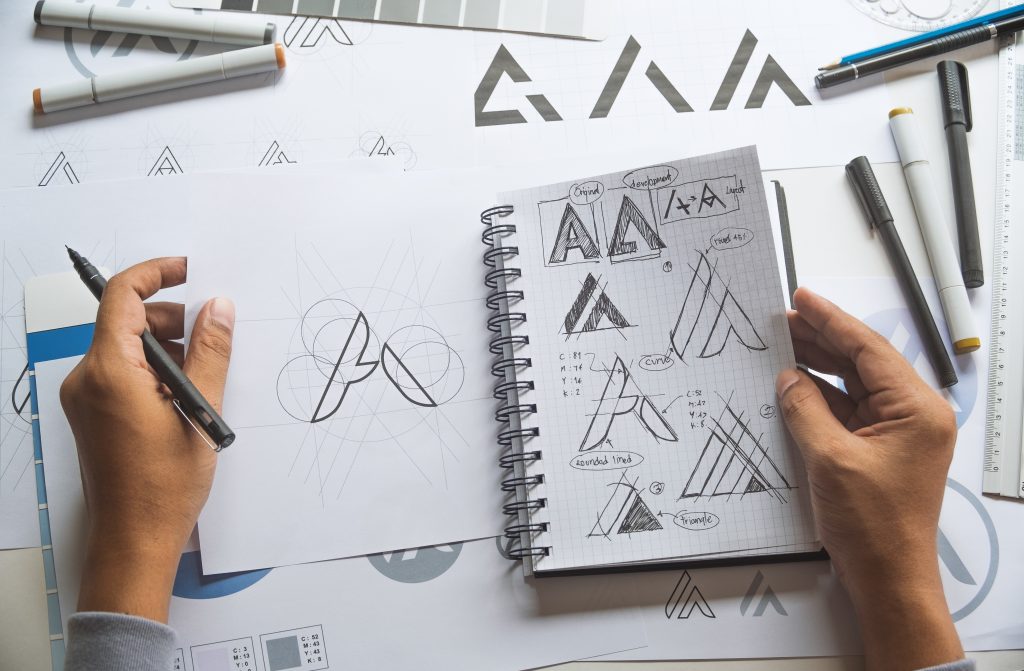
Creating a logo starting from pen and paper and then moving on to develop with a computer software, is an ideation process in which we try to synthesize the spirit and the entity of a company. Clean lines and visual influence are the superior weapon for a logo to be discernible. This does not mean producing something "obvious", but it is necessary to think of the consumers to whom the logo is intended and be consistent with the press release that the company wants to express. It must tell a knowledge, a skill, a narration. They are the small signs or symbols that trace a very precise meaning of the company value. An example is the Amazon logo: the arrow that starts from A and ends at Z indicates that on Amazon you can find everything ... from A to Z precisely! To conclude, a logo must be usable on all possible supports, from a business card to large format printing, so during the design it is essential to also think about the qualification of the various supports on which it will be used.

HOW DO YOU MANAGE YOUR COMPANY perspective? WHY THE COORDIN effigy IS IMPORTANT
The relevance of corporate identity is often underestimated. Even today, alas, some businesses do not have their own brand or logo and consequently also the individual connected image, which can make the company and its advertisements unique and identifiable in print publications and via the Internet. The effigy or coordinated image coherently dresses all the elements and visual content that are part of a brand: logo, colors, fonts, layout. It appears to be adequate when it exposes the identity of the company and remains recognizable in people's minds. The graphic designer therefore has the task of highlighting the value and fairness of a commercial activity, through the titles of communication and advertising. A coordinated effigy usually consists of paper material (business cards, letterheads, envelopes, block notes, brochures, flyers, packaging designs, etc.) and non-paper materials such as the website.
📞 Contattaci oggi stesso e scopri come valorizzare la tua immagine aziendale!
